Opti Portal User Guide
Getting Started
System Requirements
The Opti Portal is a web-based application that can be accessed from any modern web browser. For the best experience, we recommend using the latest version of Google Chrome, Mozilla Firefox, Microsoft Edge, or Safari. The Opti Portal is designed to be responsive and should work well on both desktop and tablet devices supporting a minimum window width of 768 pixels. However, for optimal performance and usability, we recommend using a desktop or laptop computer with a stable internet connection.
Login to Your Account
To log in to your Opti account, please go to https://portal.onopti.com, or https://optirtc.com and click LOG IN in the upper right corner of the screen. If you access Opti through your existing company credentials, you will be automatically signed in. Otherwise, you will be redirected to a Microsoft Live sign in page where you can enter or create your username and password.
Navigate to Your Dashboards
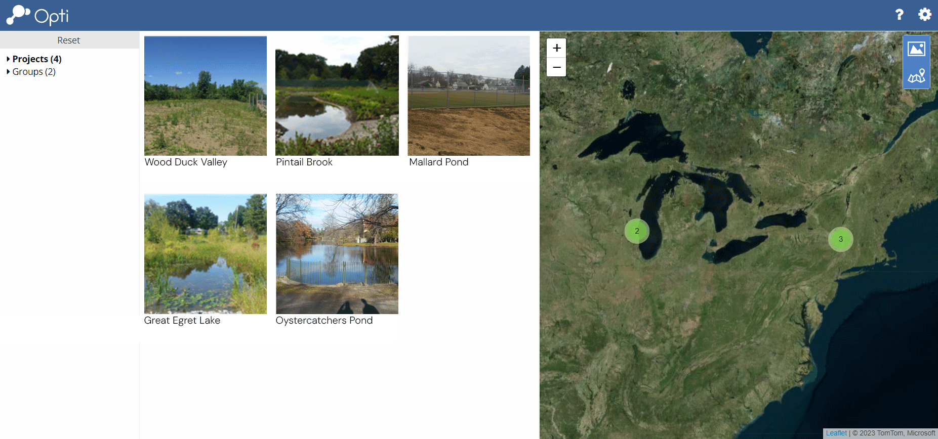
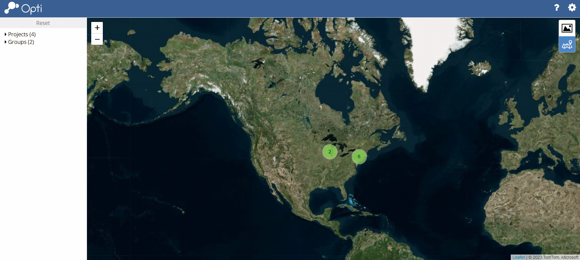
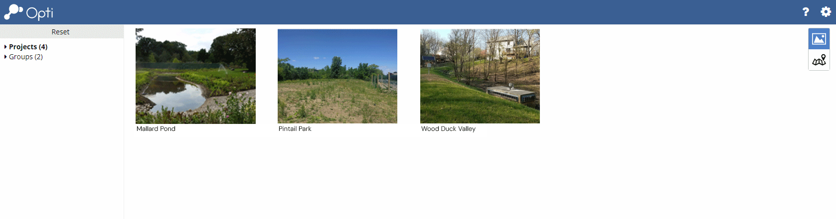
The Home View is the hub of your experience on Opti. If you have multiple sites on Opti, signing in will direct you to the Home View where you will be able to filter your dashboards by Project, User Group, and Location. If you only have one site dashboard, after you log in Opti will send you past the Home View directly to your site dashboard.
Filtering Available Dashboards
Filter dashboards by Projects and User Group by checking boxes on the left sidebar. Click Reset to clear the filter. Dashboards can also be filtered by zooming and panning within the Map.
Toggling the Map and Thumbnails
Click the Photo and Map icons in the upper right to toggle between a thumbnail view,
a map view, or both.

Open a Dashboard
Using Thumbnails. Click on a thumbnail to open the desired dashboard. From any dashboard, return to the Home View by clicking the Opti icon ( ) in the upper left corner of the screen.
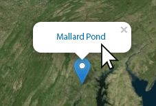
Using the Map. Click on a map pin to reveal a pop-up that provides the name of the corresponding dashboard. Click on the dashboard name to open the dashboard.
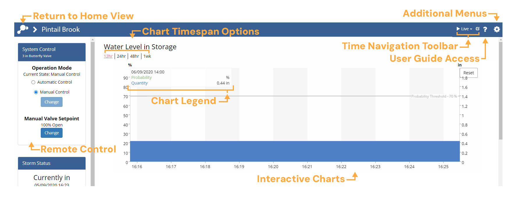
Dashboard Overview
Dashboards typically include interactive charts showing current and historical conditions, but can also include static references, such as site drawings, and animated graphics from camera or radar feeds.
If your Opti user account includes access to remote control of any OptiNimbus assets, you will also have access to a remote control pod for operating your installation securely via your dashboard. Many dashboard elements can be rearranged and customized to support your workflow.
Logout of Your Account
Click on the Gear icon  in the upper right corner of the screen and select Logout to return to https://optirtc.com.
Help or Questions?
Click on the Question icon  in the upper right corner of the screen to access this User
Guide or send an email to support@optirtc.com.
in the upper right corner of the screen to access this User
Guide or send an email to support@optirtc.com.
Interacting With Charts
Setting the Chart Timespan
Click a timespan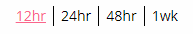 above the graph or image to change the timespan of the visualized data.
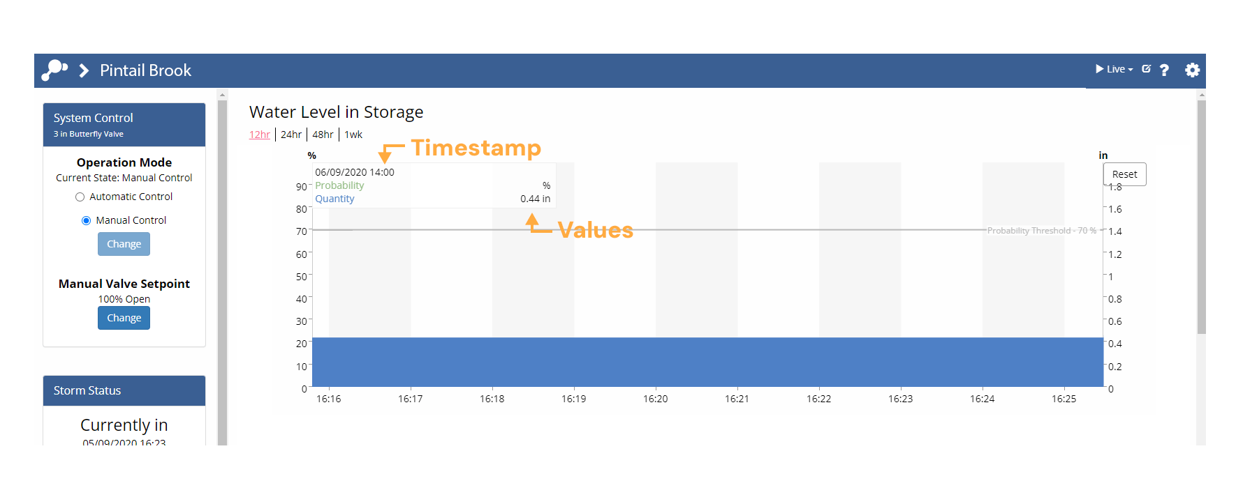
Inspecting Data
Move your cursor anywhere over a graph to show data values at that time. The values will appear in the legend in the top left of the chart and you can move your cursor along the time series to view values at any time shown. A bold circle will highlight the point on the chart currently being displayed in the legend.
Zooming Into a Chart
To more closely inspect the data, click and drag to zoom into the area of interest. Hold the
shift button and click (Shift + click) to drag the chart either vertically or horizontally. Click the  button in the top right of the chart to restore the selected timespan.
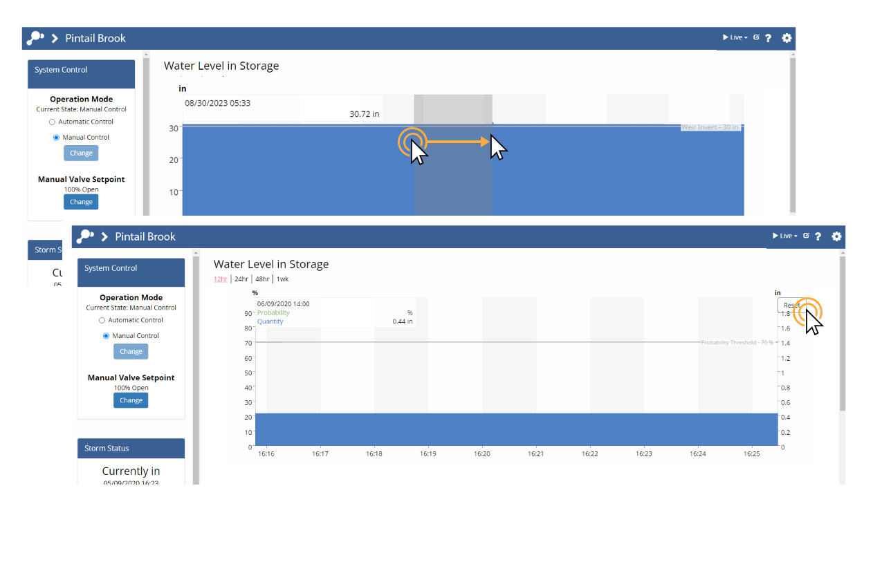
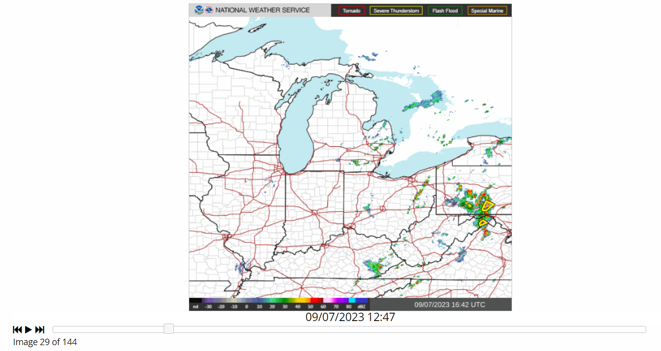
Image Playback
Select a time range other than Latest image and click (  ) to playback images over the selected timespan. Click (
  ) to increase playback speed, or click (
 ) to decrease it. You can also review images manually by dragging the slider.
Dashboard Time Navigation
Changing the Time Navigation Mode
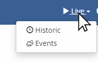
Use the time navigation dropdown in the upper right corner of the dashboard to change the time navigation mode. The example below shows how to change the time navigation mode from Live to Historic.
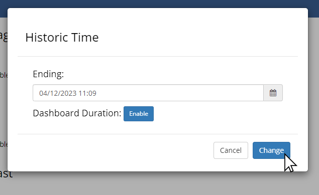
When changing to Historic mode, you will be prompted to update the select the time you would like to navigate to. This time represents the end time of the graphs displayed on the dashboard.
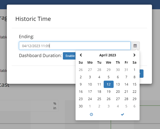
Selecting 'Change' will set the end time of the graphs on the dashboard.
Editing Time Navigation Options
Each time navigation mode has options that can be set by clicking the edit button: .
.
This will open the time navigation options window. The available options will be different for each time navigation mode. In Historic mode it will allow you to change the end time of the graphs on the dashboard or to set a Dashboard Duration, which is explained in the next section.
Snap all Charts to a Custom Timespan
While the end times of each chart on the dashboard are anchored, the timespan shown by each chart is set independently using the timespan selector. The time navigation options menu provides the ability to snap all pods to a custom timespan by enabling the Dashboard Duration feature.
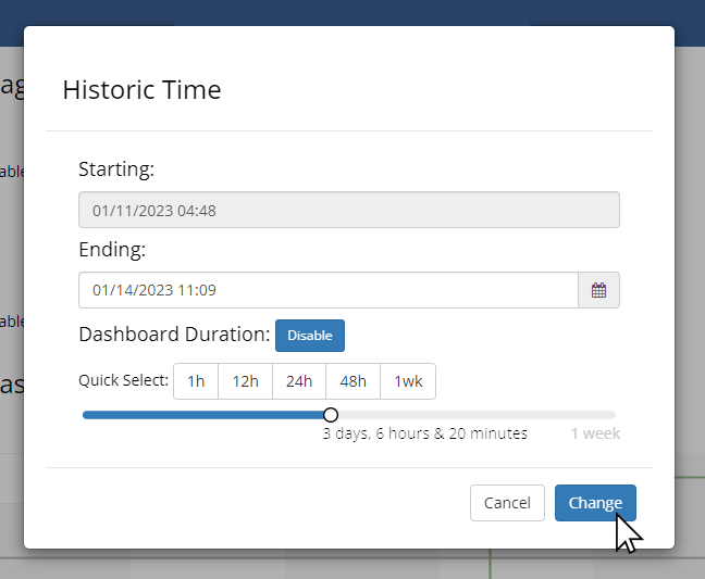
After a Dashboard Duration has been enabled, it will be set as the active timespan across all charts. However, individual charts can be toggled away from the dashboard duration to any of the available timespans using the menu above each pod. The current dashboard duration, if enabled, will be shown next to the time navigation mode in the toolbar.

The current dashboard duration, if enabled, will be shown next to the time navigation mode in the toolbar.

Bookmarking a Historical View
The current time navigation settings are captured in the browser URL so that you can easily bookmark or share a view of a historical period with others.
Note
URLs captured in Live mode will always show recent data rather than historical data.
An example of a Historic mode URL is:
https://portal.onopti.com/dashboard/1000/?t=2017-01-01T05:00:00Z
While Opti dashboards always show time consistent with the user's computer time zone, the URL time is always represented in Coordinated Universal Time (UTC). UTC is 5 hours ahead of Eastern Standard Time and 4 hours ahead of Eastern Daylight Time.
Data Export
Opti provides several data export options with different levels of pre-processing to suit your documentation, analysis, and modeling needs.
To request a data export, click on the Gear icon and select Export Data. 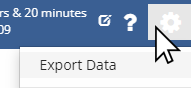 When the data export dialogue opens, the basic data export option will be automatically selected and the advanced options will be hidden.
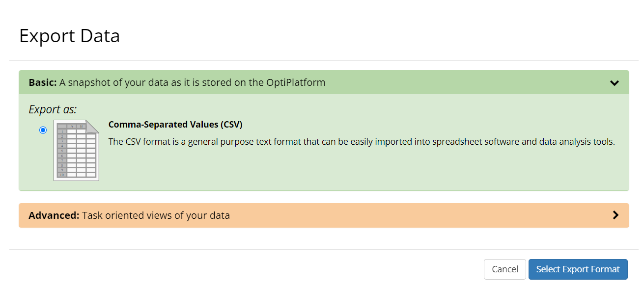
Overview of Basic and Advanced Data Export
The basic data export service provides a comma separated values (CSV) snapshot of your data as it is stored on the OptiPlatform. Rows in a basic data export will be identified with high-fidelity timestamps that represent either the measurement time or the calculation time of each datapoint.
While having access to high-fidelity timestamps is critical for some analyses, often an approximate (e.g. minutely, 5-minutely) timestamp will be sufficient. Additionally, low-fidelity timestamps are sometimes required by modeling software. For example, EPA SWMM5 supports a maximum timestamp precision of 1 minute for externally referenced time series data.
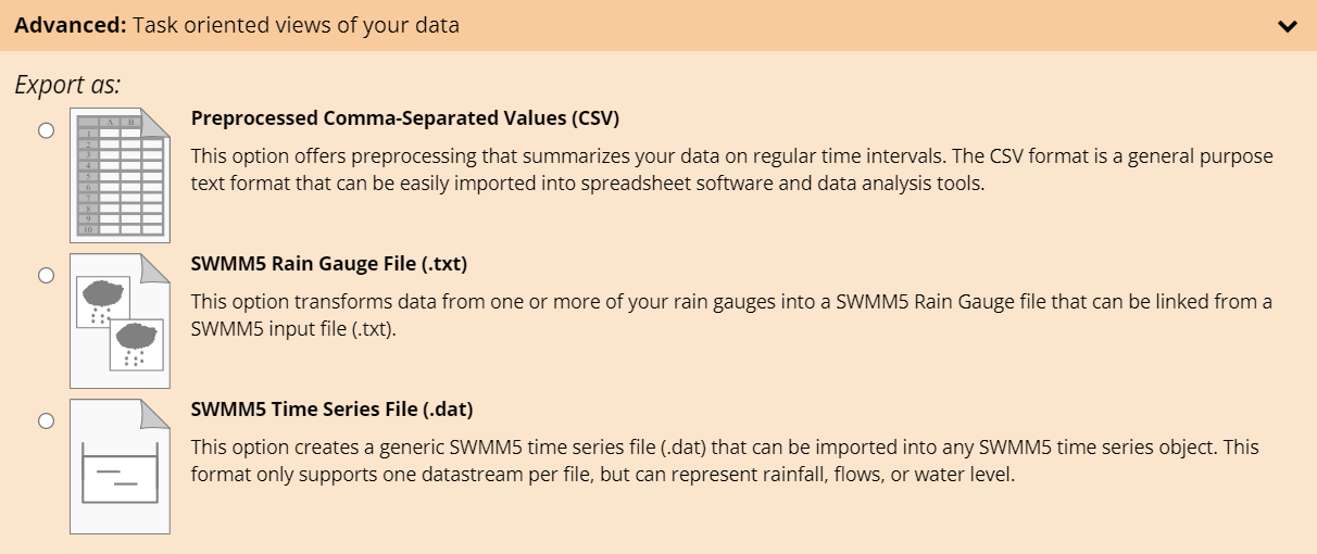
To support these cases, our advanced data export service provides a means of summarizing data with high-fidelity timestamps on regular intervals. Click the Advanced menu bar to display the full set of available advanced export options.
Basic Data Export: Comma-Separated Values
The basic data export provides a snapshot of your data as it exists on the OptiPlatform in a Comma-Separated Values format. The CSV format is a general purpose format that can be easily imported into spreadsheet software and data analysis tools. The basic data export performs no pre-processing and preserves high resolution timestamps for each data point. Enabling the Include Data Point Identities option will add an unique id to each row in the dataset.
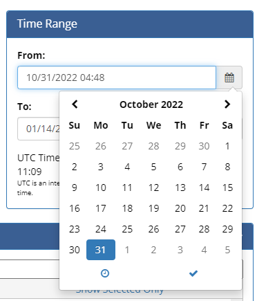
Setting the Export Time Range
The time range for an export can be entered manually in the From and To boxes or the calendar picker tool can be used by clicking the ( ) icons.
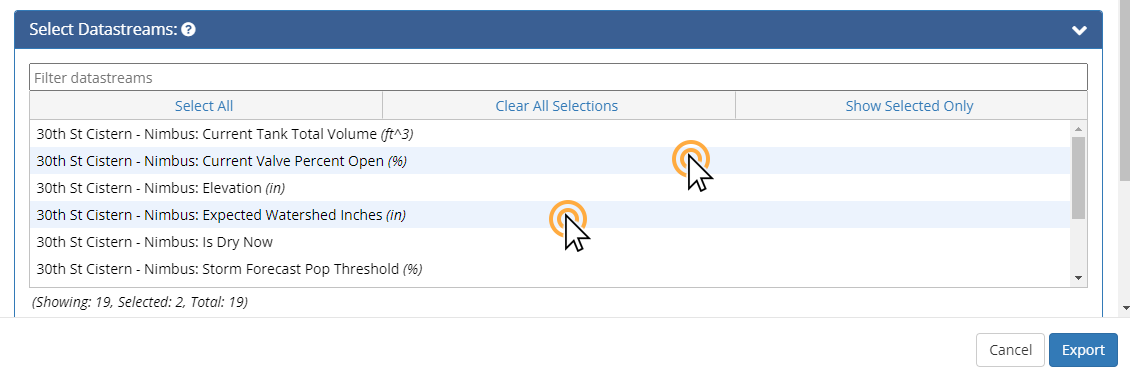
Selecting Datastreams for Export
At any time you can filter the visible datastreams to those matching the text in the Filter datastreams textbox.
Select one or more datastreams for export by clicking on them. Selected datastreams have a blue background. Click a selected datastream again to deselect.
Enable Data Point Identities (Optional)
To add a unique identifier to each row, click the Include Data Point Identities option.
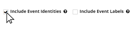
Enabling Event Identities and Event Labels (Optional)
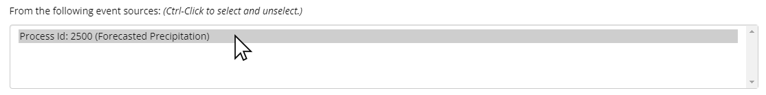
If enabled for your dashboard, you will see the option to Include Event Identities in a data export. Enabling the Include Event Identities option will add an event identifier to each row of the data export that coincides with an ongoing event. Each event will be given a unique identifier that can be used to categorize data during analysis. All rows that intersect a particular event will have the same event identifier. These identifiers can be particularly useful in data analysis as a means of categorizing data. Since the Event Identity is unique, it can be used in tools across the Opti Platform such as the Opti Event Explorer. When the Include Event Identities option is enabled, an additional option to Include Event Labels becomes available. Event Labels serve as a contextual supplement to Event Identities. Event Labels are generated according to the following formula: StartDate-StartTime_EndDate-EndTime_EventType_SystemIdentifier The dates and times are in Coordinated Universal Time (UTC) and the system identifier is a unique number associated with the system that identified the event. An example Event Identity and its corresponding Event Label are shown below. After enabling Include Event Identities, all available event sources will be listed. Use Ctrl+Click to select one or more desired event sources to use include in the data export.
Naming the Data Export (Optional)
If you would like to give your data export a memorable name, simply provide the desired file name in the Export filename textbox. If you do not provide a filename, the file will be named with the time of the export.

Submitting the Export Request and Receiving the Data
When you are ready, submit the data export request using the Export button. You will receive confirmation upon a successful export request.
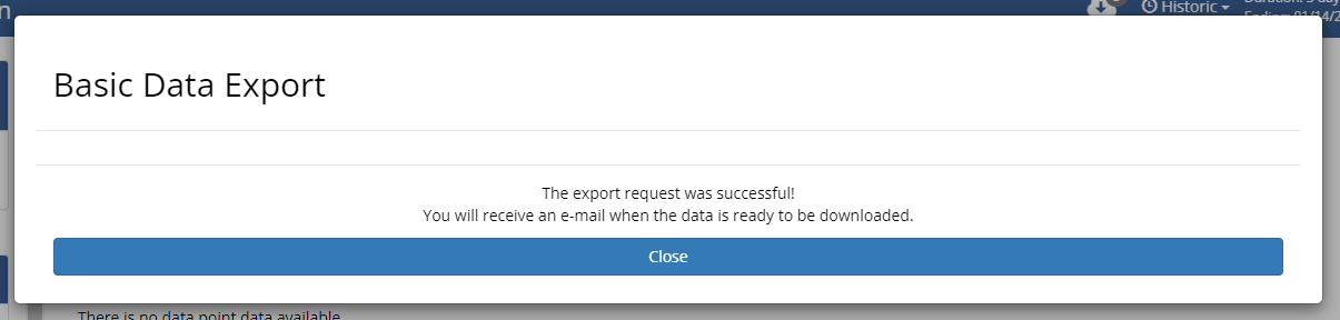
Click Close to return to your dashboard. When the export is complete, you will receive an
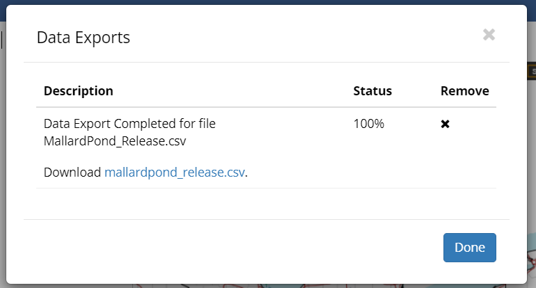
email with a link to the data export. You can monitor the progress of your export by clicking
the Download icon
 in the upper right corner of the dashboard.
Clicking on the Download icon will allow you to view the export status. You can also download the .csv file from this popup once it is complete.
Advanced Data Export
The advanced data export service preprocesses data in order to tailor it to specific analysis and modeling tasks such as disaggregation of cumulative time series, marking missing values, and importing time series into an EPA SWMM5 model. Currently the advanced export service supports export in Preprocessed Comma-Separated Values, EPA SWMM5 Rain Gauge, and EPA SWMM5 Timeseries file formats.
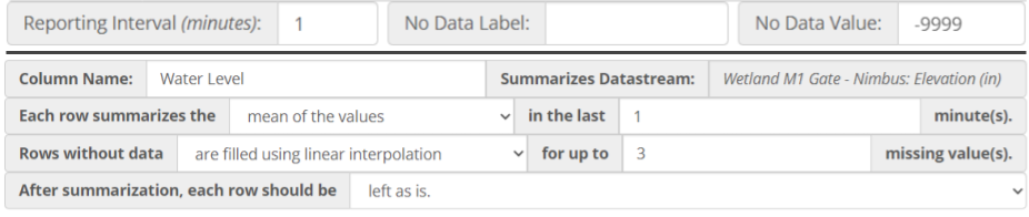
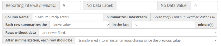
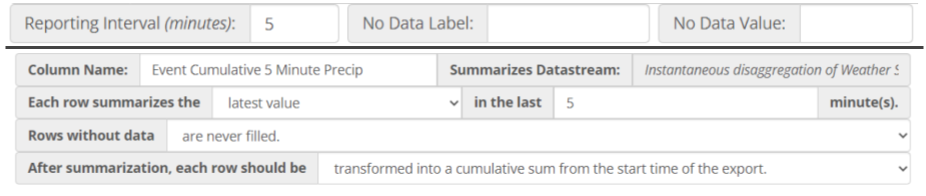
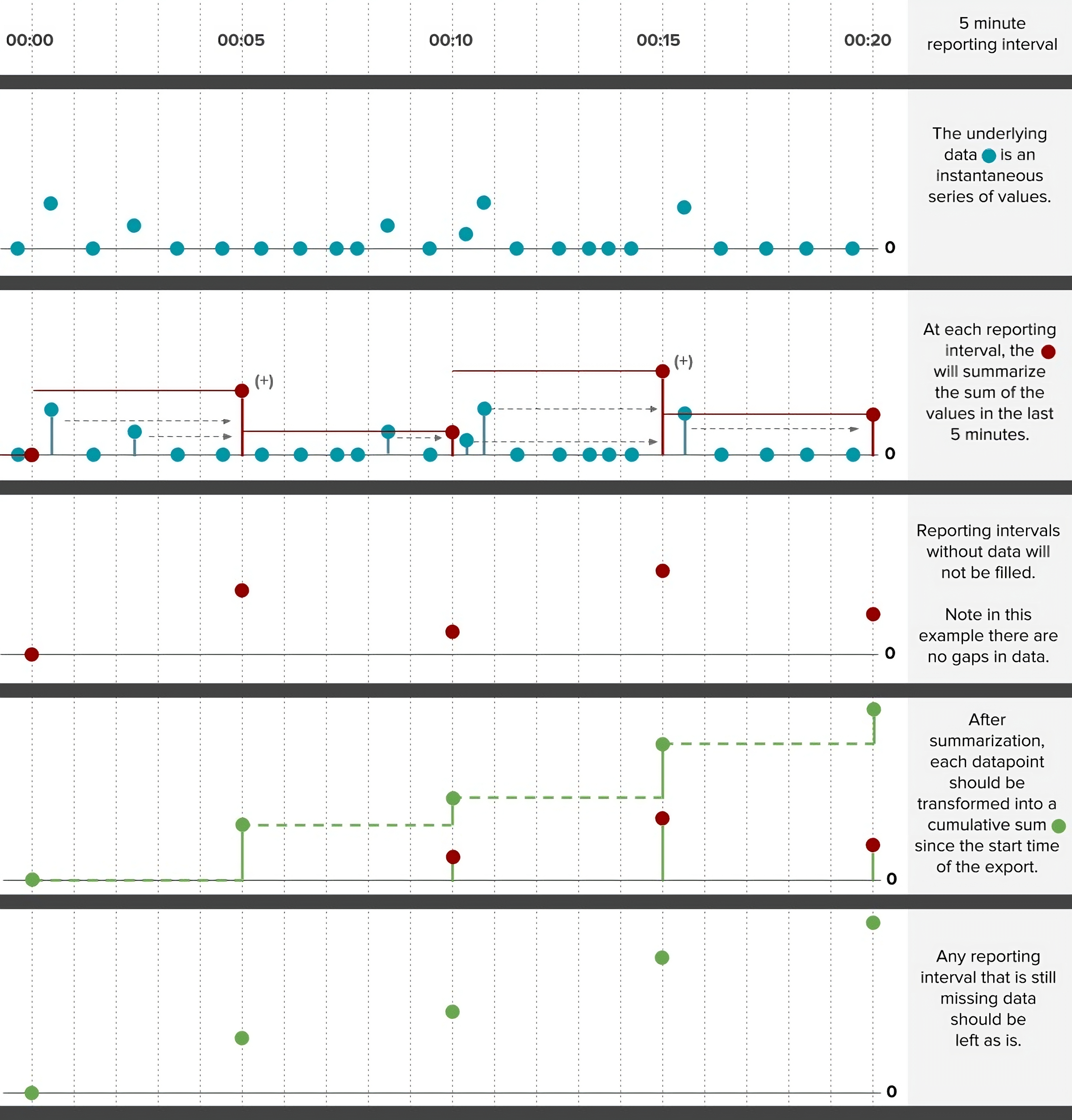
All advanced data exports reduce timestamp fidelity to report data no more frequently than once per minute. In an advanced data export request a user specifies a reporting interval, which sets the regular time interval between rows in the export. After a reporting interval has been selected, one or more datastreams can be selected to be summarized. Summarization requires selection of a summarization function and setting the historical summarization window.
If summarization results in gaps in the data, the data export request can optionally specify a gap filling method and a gap fill limit. If gaps in data are found, the gap filling method will be applied up to a consecutive gap size equal to the gap fill limit.
After filling gaps, the advanced export service will optionally perform a transformation on the summarized data to convert it from a cumulative series into an instantaneous series or to convert an instantaneous series into a cumulative series.
Even after all of the aforementioned steps some records may still be missing data. In these cases it is possible to specify a uniform label for all missing data using the No Data Label option. The No Data Label applies a custom text-based label to both numeric and non-numeric data (e.g. “NA”). Likewise, a distinct label can be applied to missing numeric data using the No Data Value option (e.g. -9999). These options are not supported by the EPA SWMM5 formats.
Please see the [detailed examples](#example-5-minute-precipitation-totals-from-a-cumulative-datastream] for a graphical depiction of how this preprocessing sequence is carried out.
Preprocessed Comma-Separated Values
Select a reporting interval appropriate to your task. Common values include minutely, hourly, and daily. Selecting the time range for export and datastreams for data export is the same as in the basic data export case. However, once the datastreams are selected, they need to be dragged to the Column Definition section to fully specify the export options.
For each datastream dragged into the column definitions section, a column will be created in the export file according to the corresponding column definition. Note that the same datastream can be dragged multiple times to create multiple columns, each with a different view of the same underlying datastream.
Each column definition provides a human readable description of the preprocessing steps that will be taken to produce the column. Note that not all preprocessing options are available for all datastreams. For example, when exporting non-numeric data streams it is not possible to apply numerical summarizations (e.g. min, max, mean). The steps to request and receive the export are the same as in the basic export case.
SWMM5 Rain Gauge File
The SWMM5 Rain Gauge file format supports one or more rain gauge time series for direct import into EPA SWMM5. Specifying the data export is the same as in the Preprocessed CSV format case, except that the supported datastreams are restricted to those associated with precipitation. Column names are also restricted to comply with SWMM5 format requirements. The steps to request and receive the export are the same as in the basic export case.
SWMM5 Time Series File
The SWMM5 time series file format supports importing one water level, precipitation, or flow time series into EPA SWMM5. Available datastreams are limited to these types. Specifying the preprocessing steps is similar to the other advanced data export formats. However, since only one time series is supported, there is no need to drag the selection to the definition section to begin specifying the preprocessing steps. Column names are restricted to comply with SWMM5 format requirements. The steps to request and receive the export are the same as in the basic export case.
Example: Using Linear Interpolation and No Data Values
Example: 5-minute Precipitation Totals from a Cumulative Datastream
Example: 5-minutely Cumulative Precip. from Instantaneous Precip. Datastream
Advanced Tools
Remote Control
If you have OptiNimbus, your site is automatically and optimally controlled by Opti. However, when manual control is required for maintenance or other purposes, authorized individuals can operate the OptiNimbus site using the remote manual control system built into your dashboard.
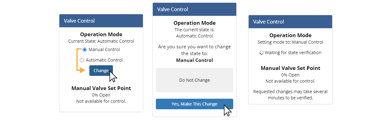
Change the Operation Mode from Automatic to Manual Control
Select the Manual Control option under Operation Mode and click Change to control the system manually. Confirm your selection.
After submitting your request, the system will wait to verify the operation mode change on the remote device was successful. During this time no users will be able to submit other remote control requests to the remote device. There is no way to cancel a pending request, but if the request is unsuccessful (e.g. due to cellular connectivity issues) the control pod will return to its original state and a new request can be submitted.
Return to Automatic Control from Manual Control
Select the Automatic Control option under Operation Mode and click Change to return the system to OptiNimbus control.
Change the State of a Binary Outlet Control
Once in Manual Control, select Open or Close and click Change to adjust the valve state. Confirm your selection.
Change the State of a Continuous Outlet Control
Once in Manual Control, click Change, then move the slider to the desired valve position, or type in the desired valve position, and click Commit. Confirm your decision. The validation process can take several minutes to complete.
Failsafe Modes
Control Panels are able to take actions independent of Opti's predictive automation, for example, when the panel has not received a command from the Opti Cloud in too long. Each configured condition in which a Control Panel overrides Automatic Mode is known as a Failsafe Mode. A Failsafe Mode has one actuator position: when the Control Panel transitions into a Failsafe Mode, it will move the actuator to the associated position.
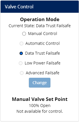
There are three Failsafe Modes, although most Control Panels will only have one or two configured. Radio options for Failsafe Modes are greyed out and unavailable to be selected on Opti Portal dashboards because only the Control Panel can 'decide' to transition to a Failsafe Mode. To ensure safe conveyance, configuration of Failsafe Modes is considered during the design phase of each site, see our Statement on Security's position on Civil-Integrated Failsafes.
Data Trust Failsafe
Data Trust Failsafe occurs when the Control Panel has not heard a target from the Opti Cloud for longer than a configurable duration, by default, 2 hours. There are several underlying reasons this condition can occur:
- Communications with the Control Panel are interrupted, and commands are not getting through.
- Sensors are reporting implausible information, and the Opti Cloud is deliberately not sending a new target.
- Weather forecast information has been unavailable for several hours, leading to a lack of predictive information with which to set targets.
- An internal issue with the Opti Cloud is causing it to not issue commands to Control Panels.
When a Control Panel is in Data Trust Failsafe and communications with the Panel are not interrupted, users can use Remote Control to change the actuator position from the dashboard if they need to override the pre-configured failsafe position. Many Data Trust Failsafes are caused by disruptions to underlying services such as cellular telemetry or weather forecasts, and either resolve themselves or are resolved by Opti engineers as part of an incident response. When Opti is working on an incident response, we will post updates about the scope and status at https://status.optirtc.com. In the rare case when a prolonged Data Trust Failsafe impacts your facility, Opti Customer Success will follow-up with your account administrators to determine what needs to be done to restore normal service.
Low Power Failsafe
Low Power Failsafe kicks in when the power supply is down and any backup only has enough energy left to finish moving the actuator to the configured failsafe position and finish any other shut-down procedures required. Only Control Panels with a Uninterruptible Power Supply (UPS) will have Low Power Failsafe configured.
Advanced Failsafe
Advanced Failsafe provides a configurable set of rules that Opti Customer Success can apply to implement particular site-specific local control as requirements may dictate. Advanced Failsafe Mode will always be named something specific to the particular application on Opti Portal Dashboards.
Exceptional Conditions Only
Because it overrides a panel's other automatic behaviors and has limited functionality, Advanced Failsafe does not enable general-purpose SCADA-like functionality and is not recommended for most applications. Opti Sales and Customer Success can discuss whether it is appropriate for a particular CMAC installation, and help you consider other solutions for managing on-site operations.
Analysis View
Analysis View allows you to quickly enable and disable plots of relevant datastreams to perform exploratory data analysis. If Analysis View is enabled for your dashboard, it can be accessed from the Gear icon .
When in Analysis View, simply toggle individual plots on and off by clicking in the checkbox to the left of each datastream name.
Event Explorer
Opti Event Explorer is an advanced time navigation tool that allows you to quickly visualize, filter, and navigate to periods of activity at your Opti installations. These periods of activity are automatically identified and summarized by your Opti product installations based on forecasted or measured precipitation.
Opening Event Explorer
To open Event Explorer from Live or Historic mode, select Events from the Time Navigation drop-down menu. Once you have navigated to an event, your dashboard will be set to Events mode. To re-enter Event Explorer from Events Mode, click the edit ( ) button in the Time Navigation toolbar.
Event Explorer Layout
The Opti Event Explorer interface is divided into three regions: an interactive timeline that shows the distribution and duration of events across product installations; a table that provides at-a-glance event summaries; and a collection of filters that allow you to quickly identify events meeting specific criteria. Each of these features works together to help you find and explore the events that matter for your analysis. We'll cover each of them in more detail in the following sections.
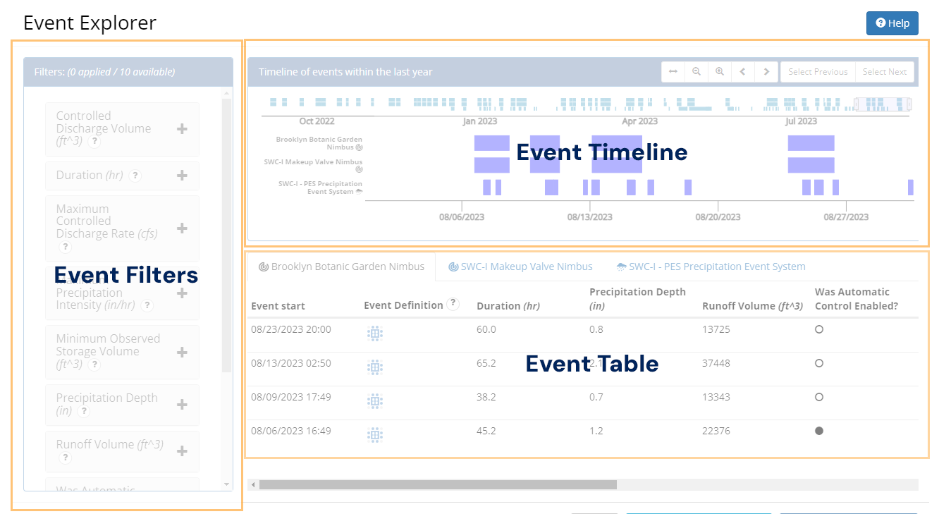
The Event Timeline
Opti Event Explorer provides an event timeline with two views of the timing and duration of events automatically identified by your Opti product installations. The upper timeline shows all events identified within the last year, while the lower timeline shows only those events highlighted by the viewfinder. The upper timeline is useful for investigating long-term patterns (e.g. seasonal) in event frequency and duration, while the lower timeline is useful for focusing on a specific region of time. The viewfinder provides an easy means of changing the region of time that is in focus in the lower timeline.
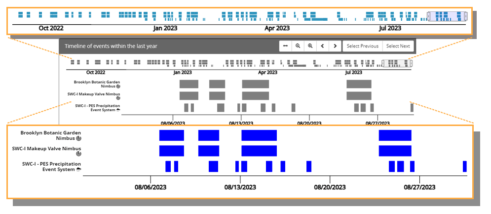
The viewfinder narrows the scope of the lower timeline to the range highlighted in the
upper timeline. The viewfinder can be panned left and right by clicking and dragging it
from its center. The viewfinder can also be stretched by clicking and dragging on either of
its side handles. The viewfinder toolbar provides additional controls, including the option
to zoom to all ( ) events in the upper timeline.
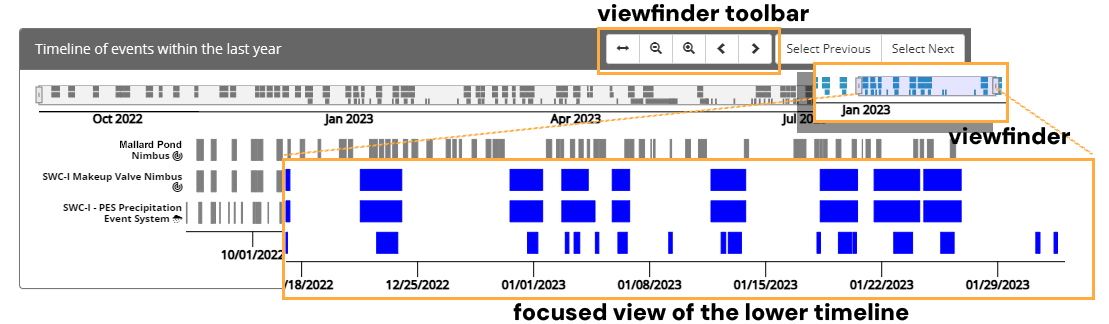
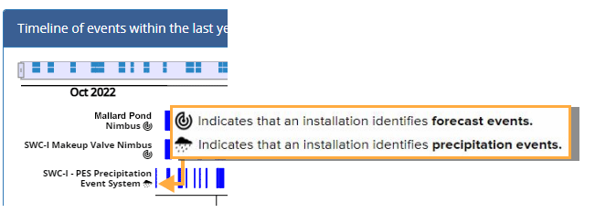
Each time series (i.e. row) in the upper and lower timelines corresponds to a particular product installation. Each product installation identifies only one type of event. Nimbus systems, which utilize forecasted precipitation to provide proactive stormwater control, identify forecast events which are based on periods of forecasted precipitation. The Cumulus products, on the other hand, utilize an on-site rain gauge to identify and separate precipitation events on the basis of recorded precipitation.
Clicking on an event in the lower timeline selects the event. Selecting an event highlights its corresponding event summary in the event table and stages it for presentation on the dashboard. Clicking Navigate to Selected Event will close Event Explorer and cause the dashboard to load data for the duration of the event.
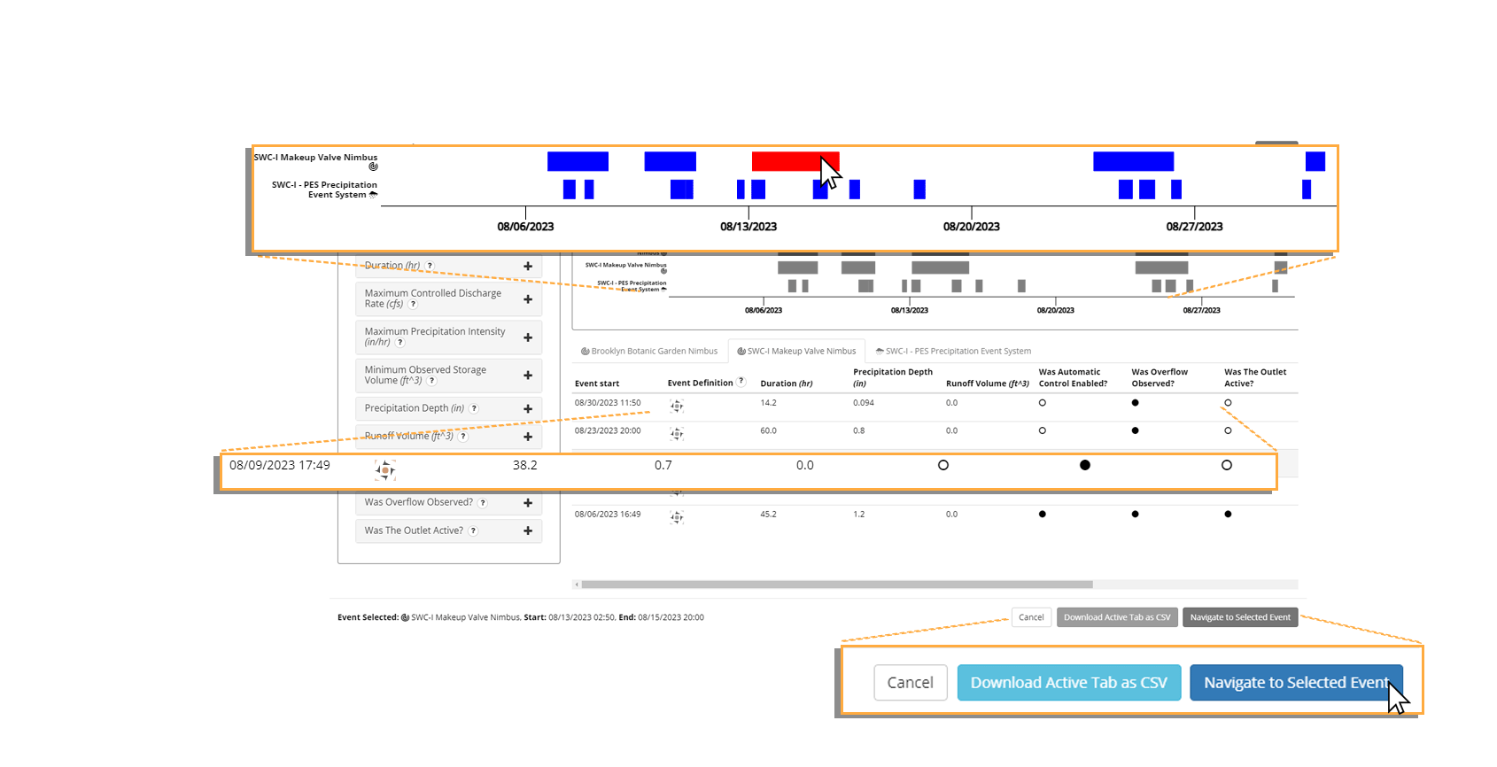
The Event Table
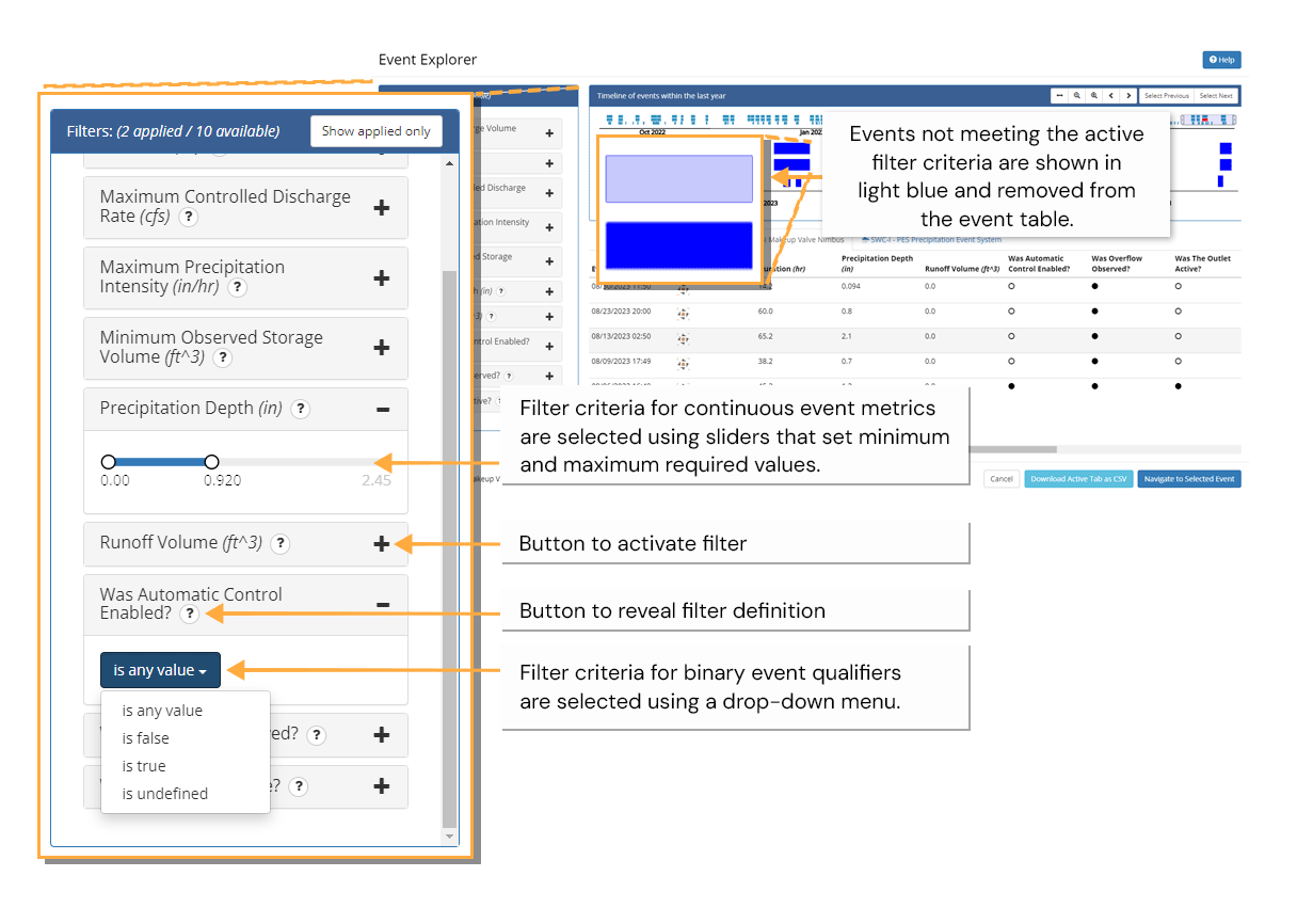
Opti Event Explorer provides an event table with summaries for each event. When not being filtered, the event table provides a summary for each event that is currently visible in the lower timeline. When filters are active, only those events that are both visible in the lower timeline and meeting the active filter criteria are displayed. The event table organizes events into separate tabs for each product installation. These tabs correspond one-to-one with the time series in the timeline view. Event summaries include both discrete and continuous indicators of the event's significance. Binary (true or false) indicators are referred to as event qualifiers while continuous indicators are referred to as event metrics.Event qualifiers are represented in the table as filled (true) or empty circles (false). All qualifiers and metrics are available as filters in the filter menu.
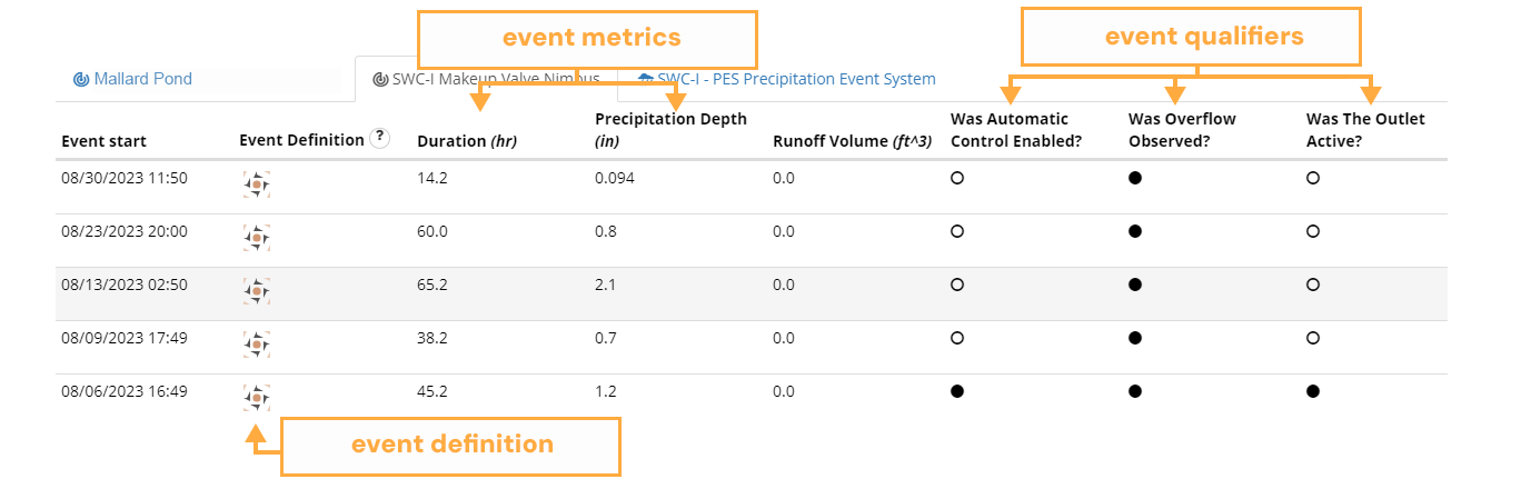
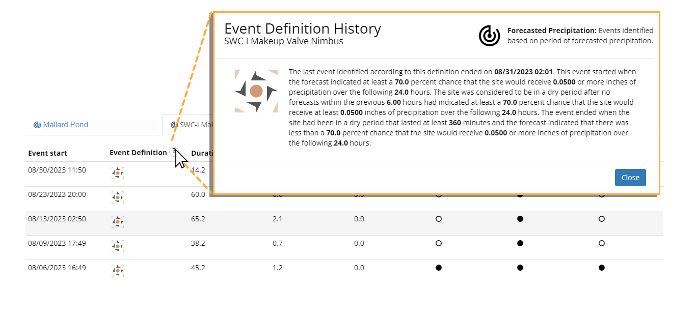
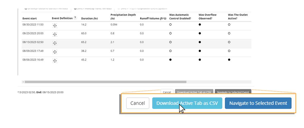
While the event qualifiers and event metrics describe the outcomes of the event, the event definition column provides a graphical representation of the definition that the product installation used as the basis for identifying the start and end of the event. Changes to this definition (e.g. an update to a minimum inter-event duration) will be captured by a change in the icon. This provides an at-a-glance answer to the question: were these events identified on the same basis? The explicit event definition is available by clicking the question mark icon in the column header, as shown in the example on the next page. A copy of the currently active tab can be downloaded as a CSV file by clicking Download Active Tab as CSV. Only events that can be found in the active tab will be included in the export. To export all events within the last year for a particular product installation, disable all filters and click the zoom to all () button in the viewfinder toolbar.
Revealing the Event Definition
Download Active Tab as CSV
Event Filters
Events can be filtered in Opti Event Explorer by activating any of the available filters in the filter menu. Active filters are shown as expanded boxes with either drop-down menus or sliders showing the active filter criteria. Inactive filters are collapsed, but within an Event Explorer session their previously set criteria are stored for simple re-activation. Filters are only applicable to products installations that produce the metrics or qualifiers of the same name. Some filters that share a similar conceptual definition (e.g. duration) are common to multiple product definitions. When this is the case, the filter definition will provide product-specific guidance on how the metric or qualifier is determined.